

ou can have the most visually stunning online store on the internet and still fail to make consistent sales. Conversion isn’t about aesthetics alone — it’s about strategy embedded into every design decision, from how your product images are sized to how many fields your checkout form contains. The stores that convert well aren’t necessarily the prettiest. They’re the most intentionally designed.
The Anatomy of a High-Converting Product Page
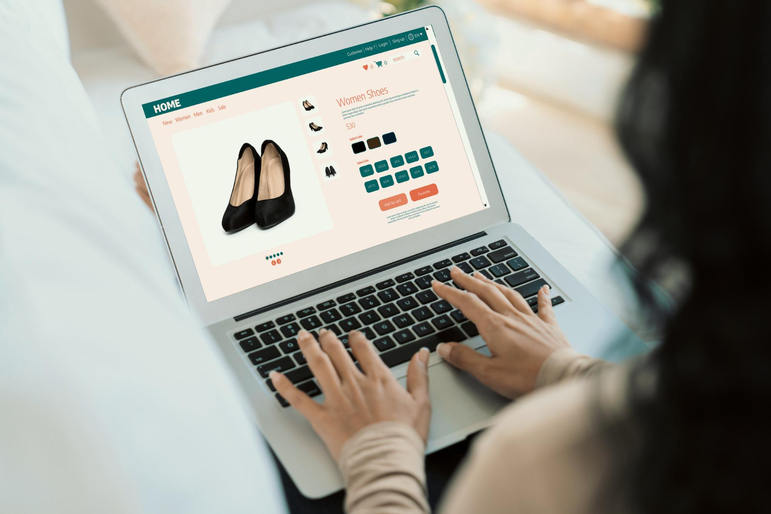
Your product page is where the purchase decision is actually made — and it’s worth treating it with the same strategic care as a landing page specifically designed to sell:
- Clean, high-quality imagery — Multiple photos showing the product from different angles, at different scales, and ideally in real-world context. Images do the work that a visitor would otherwise have to imagine.
- Benefit-focused descriptions — Not just what the product is, but what it does for the buyer. Features tell; benefits sell.
- Social proof within reach — Reviews, ratings, and user-generated content positioned near the add-to-cart button, not buried below the fold.
- Scarcity signals used honestly — “Only 3 left in stock” or “Selling fast” — when genuine — create appropriate urgency. Manufactured scarcity erodes trust quickly.
- A clear, uncluttered add-to-cart button — One primary action. No competing links, no distracting navigation, no sidebar ads fighting for attention at the moment of decision.
Homepage Design for eCommerce: First Impressions Set the Stage
Your homepage doesn’t need to be your best-selling product — it needs to be your best first impression. For eCommerce sites, that means:
- A hero section with a clear, specific value proposition — not your brand name in large letters, but what makes shopping with you worth it
- Trust badges positioned prominently: secure checkout, free returns, satisfaction guarantees — whatever your competitive advantages are, show them early
- Featured or best-selling products that give visitors an immediate sense of your range
- Intuitive category navigation that makes it effortless to find products without thinking
- A search bar that’s genuinely visible, not tucked in a corner icon
Every element of your homepage should either build trust or move visitors toward a product. If it does neither, it’s a distraction.
Checkout Is Where Most Stores Lose Sales
Industry data consistently shows that the checkout process is the highest-friction point in eCommerce — and the place where the most revenue is lost. Cart abandonment rates average around 70%, and a significant portion of that abandonment is caused by poor checkout design:
- Too many steps between “add to cart” and “order confirmed”
- Requiring account creation before purchase — one of the single highest abandonment triggers
- Insufficient payment options — if someone’s preferred method isn’t available, they leave
- Confusing or hidden shipping costs revealed only at the final step
- No visible trust signals (SSL badges, secure payment icons) at the most sensitive stage of the transaction
Great eCommerce design treats the checkout process as a journey of reassurance: every step should reduce anxiety, not add it.
Platform Matters, But Design Matters More
Whether you’re on Shopify, WooCommerce, or another platform, the design and strategic decisions made by your designer will consistently outperform or underperform whatever the platform’s defaults are. A well-designed WooCommerce store will outconvert a poorly designed Shopify store, and vice versa.
The [INTERNAL LINK: eCommerce Website Design] and [INTERNAL LINK: Shopify Design Services] at Cre8ive Options are built around conversion — because a beautiful store that doesn’t sell is just expensive decoration.
Ready to Build an Online Store That Actually Sells?
Whether you’re launching a new store or optimizing an existing one, let’s talk about what it would take to turn your traffic into customers. Reach out and let’s start the conversation.