If you’ve been contemplating making changes to your website design, now could be the right time. The developments showing favor in 2015 could turn your outdated model into a sales-generating-machine with the right strategy.
While 2014 earmarked notable rises to more code-free design options, parallax effects, skeuomorphism, flat design, mega-menus, and larger than life imagery, there’s no arguing the most significant impact was made early in the year when Internet usage on mobile devices exceed PC usage for the very first time. Since then, many businesses and brands have been struggling to define a response and leverage executable strategies to help themselves catch up.
Google’s recent announcement to include mobile-friendliness as an actual mobile ranking factor, beginning in just a few weeks, almost assures 2015 to be dubbed the year mobile conversion takes its rise. But, will your site be ready to cash in on the escalation?
Having a website design that puts mobile usage at its forefront is no longer an option and below are eight web design trends currently impacting the way eCommerce websites are designed:
Responsive Designing
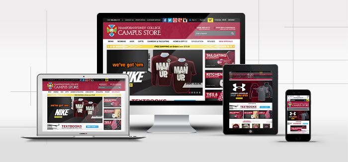
Responsive designing is not a buzz term, neither is it technically new. Responsive Website Design has actively been gaining in popularity over the course of the past three years. Its principle beauty is in its ability to modify the placement of a website’s content to display according to the screen resolution of the device on which it’s being viewed. This in turn, makes a website friendly for viewing across multiple devices and in-particular a popular choice for those who foresaw the rise and need of a more fluidly comprehensive mobile solution. Google’s impending mobile algorithm change (slated to deploy April 21) is now acting the part of a deadline, pushing any leftover naysayers to seriously consider adapting to a mobile solution or risk possible penalties; responsive website design offers store owners a viable choice.
Responsive website design not only takes into consideration the current spotlight on mobile, but as the availability of internet-ready devices continues to grow, so will websites who choose to engage in responsive solutions. Unlike counterparts who are dedicated to device-specific-solutions, responsive design sets the foundational stage for not only micro device development, but also to consider larger desktop monitors, internet-ready wide screen televisions, even gaming consoles all growing in popularity to provide access for browsing online.

Navigation and Structure
Designing a website that can translate across multiple devices is a unique challenge. Not only should today’s web designing practices take into account translating to smaller (mobile) devices, but also the rise in big screen accessibility. These adaptations require a more common sense and user-friendly approach than in years past when store navigations where devised strictly for SEO benefit. To survive in 2015, store navigation must pave a clear and concise path to products and ideally, in fewer steps.
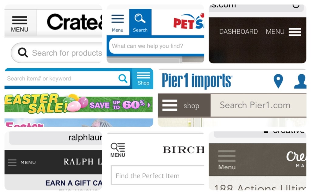
Overburdening customers with too many choices can lead to confusion and quick abandonment; conversely, offering too few channels without accompanying filter, smart search and helpful sorting actions leaves customers facing cumbersome layers and feeling frustrated. As sites get smaller and smaller, these loaded navigations can literally get in the way of the user experience. To help rectify part of this growing issue, micro-condensed and hidden menus (the “sandwich”) are already finding their way onto desktop and larger screen sizes. This trend is likely to take a slightly slower adaptation as there is still evidence that not all users yet identify these icons as menus. Don’t be surprised, as this trend continues to evolve to see associated text such as the word “menu” location with the icon.
(As always, each store should study your analytic data and consult with SEO intelligence to consider big switches in your navigational hierarchy – Need help getting Google Analytics’ set up? We can help.)

Mobile Friendly Behaviors
Transitioning traditional mouse and monitor experiences to small-screened devices is not straightforward. While mobile users are savvy, moving users from all clicks to taps and swipes is still a learning curve to overcome. If you own or have ever used a touchscreen device, you are not alone in having linked to or activated a link which took you some place you didn’t intend to go. As touch-sensitive response on devices continues to rise, so will the need to introduce similar experiences that are still finger-friendly.
Effects and Transitions
“The devil’s in the details” has never been truer than in developing today’s responsive web designs. Site UX effects and transitional elements brought about by the development of CSS coding not only add to the enjoyment of interacting with a site, but they are essential in validating a user’s actions with the site content. Hover effects on navigations, highlighted boxes and buttons, clever hide-n-show text, and even floating components, all add to the overall experience. An elevated eCommerce site experience excites users, helps to increase their engagements and when executed well, should contribute to increased conversion.
Card Design
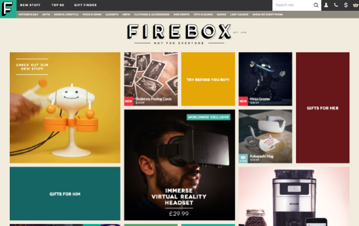
Card design will continue to lead the pack in this year’s developing design trends. In brief, Card design presents a strategically condensed amount of information within a clean square or rectangular space. To see card design in action you don’t have to look too far; Google, Facebook, Twitter, Pinterest and Dribble are all excellent examples of card style designing. The rise of card design has been birthed out of the necessity to present information on a fluid grid system that easily translates onto screens of all shapes and sizes; i.e. it is easily responsive. When executed well, card design packs a lot of punch into a small space and is incredibly user-friendly, often offering site effects, transitional actions and icons to convey available actions to the user.
Cards are also paving a shift away from traditional page layout to a more modular presentation of information whereby the user has control over how collections of information are displayed and where.
While Card style designing in eCommerce is still developing, there are a handful of sites already on its cutting edge. Firebox.com is a great example of Card Design for eCommerce.

Flexible Typography
Google fonts and web kits have made an enormous impact on the way we use fonts in web designing today. Long gone are the days of having to embed font styles into graphics to achieve a branded aesthetic. The wide assortment of font alternatives today have played a role is making text on a website not only part of the messaging but also part of its aesthetic.
Large headlines, body text and content can now be realized easily and with cross-device-compatibility intact. Lest you think this means you should go crazy utilizing a shmorgishborg of fonts, a more common sense approach of no more than 2-3 font styles together should be realized. Consider a font style for headlines; a style for body, description and general content; and a font style for pricing, buttons, and important highlights. Staying close to this formula will help you produce a fluid appearance throughout your site.
If exploring typography is a new adventure for you, check out this quick list of currently trending styles:
- Roboto http://www.google.com/fonts/specimen/Roboto
- Raleway https://www.google.com/fonts/specimen/Raleway
- Lato https://www.google.com/fonts/specimen/Lato
- Proxima Nova & Proxima Nova Soft https://typekit.com/fonts/proxima-nova
- Gotham & Gotham Rounded http://www.typography.com/fonts/gotham/styles/
- Montserrat https://www.google.com/fonts/specimen/Montserrat
- Ubuntu http://www.google.com/fonts/specimen/Ubuntu
- Brandon Grotesque https://typekit.com/fonts/brandon-grotesque
Photography & Images
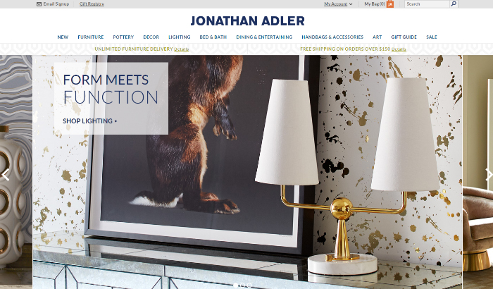
Let’s face it; images sell and eCommerce businesses adopting their importance in website design are reaping high returns not only in patron increase, but in customer loyalty. When shopping online, your product images are the closest the customer will come to tangibly considering your items prior to purchase and arriving in their home. Today’s customers expect to find multiple angles, and enlarge/zoom image views which allow them to inspect a product in fine detail. To put your best foot forward, make sure your images are showcased in the best possible light, in as many dimensions as possible, and displayed with the best quality tools you can afford. Keep in mind that while powerful images built trust, poor images exude cynicism. Low-quality images & photography reflect poorly on your business so this is not an area to skimp on the resources.

Reinventing Color and Texture in Design
Last year’s wave to jump on the responsive bandwagon also helped propel a lunge towards flattening almost everything. While Microsoft, Google and Apple all took their turn towards flat and skeuomorphism design styles, that doesn’t mean it’s for you.
Fearful that site load would present trouble for website owners, stripping websites down to their bare bones continues to leave many sites taking on similar appearances. In a world where online competition is arguably nearing a peak, looking just like your competitor is not the optimum strategy, and could likely turn out to be rather detrimental. Today’s web development teams are going to have to think multi-dimensionally about balancing the use of color, textures, imagery and frames that are also scalable. At the end of the day, a less-is-more trend will continue to grow.
